How do visuals shape political discourse? In a recent work for PolarVis I have developed an interactive Power BI report to explore how environmental-related images influenced public reactions during the 2021 German federal elections.
Images are powerful tools for persuasion. They can evoke strong emotions, simplify complex ideas, and rapidly spread messages across vast networks. The objective for this project was to analyze how environment-related images were propagated on social media during a critical political period, and how the public reacted to them. This involved understanding not just what was shared, but also the underlying emotional responses and sharing behaviors.
A Glimpse into the Data
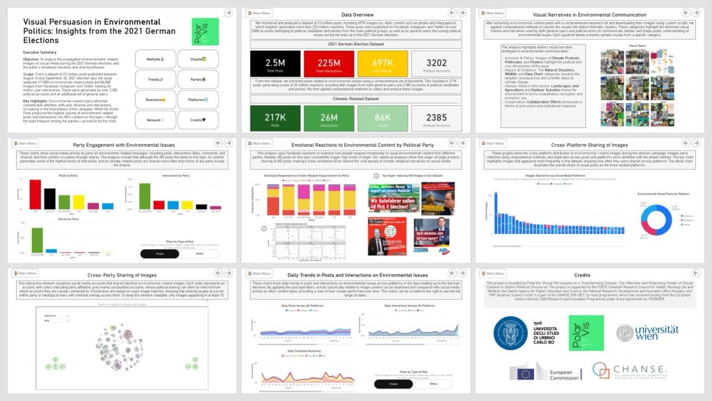
I worked with a substantial dataset: over 2.5 million social media posts published between August 16th and September 26th, 2021—the day of the German federal elections—which I had previously collected for a project commissioned by the Media Authority of North Rhine Westfalia. This massive collection included nearly 700,000 images and generated over 225 million interactions across Facebook, Instagram, and Twitter. The data originated from a diverse set of sources, including over 3,000 political accounts and thousands of general users.
From this broader dataset, I honed in on environmental-related content, identifying over 217,000 posts containing 86,000 unique images that generated 26 million interactions. This focused dataset allowed for the analysis of climate and environmental communication.
Key Highlights from the Analysis
The findings revealed some compelling insights into the dynamics of visual persuasion in environmental politics:
- Environmental Topics Resonated: Environmental topics consistently attracted considerable attention, driving significant post volumes and interactions, especially as the election campaign progressed.
- The Green Party’s Visual Prowess: Not surprisingly, the Green Party produced the highest volume of environment-related posts and interactions. Their content demonstrated a clear strategy in leveraging visual messaging.
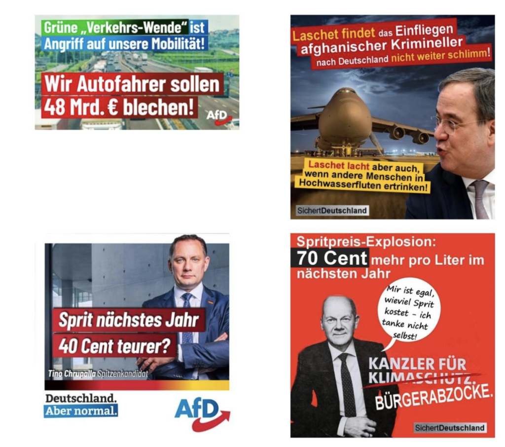
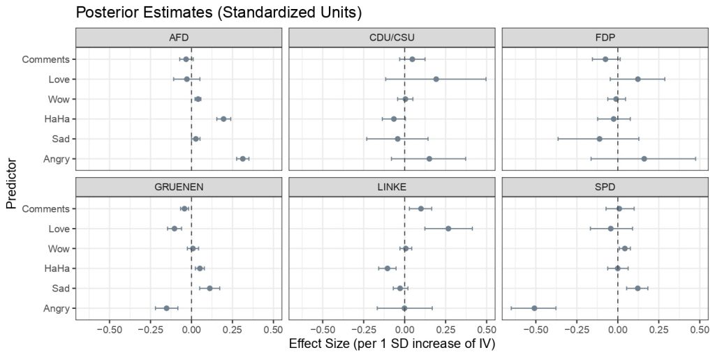
- The Power of Emotion (and Anger): Interestingly, although the right-wing and climate-skeptic party AfD (Alternative for Germany) posted comparatively less environmental content, their visual material generated shares second only to the Greens and elicited the highest levels of user anger. Statistical analysis I conducted shows that anger reactions are a stronger predictor of AfD shares. This indicates a powerful—albeit polarizing—emotional dynamic driving the spread of climate-skeptical narratives.
Technical Stack and Methods
This project leveraged a robust set of tools and methodologies to handle the scale and complexity of the data.
Data Collection & Preprocessing:
- Data collection involved the use of multiple social media API endpoints, which were queried at regular intervals through R scripts in the six weeks leading up to the elections. This was followed by the creation of R scripts for scraping images from Facebook, Twitter, and Instagram.
- Environmental posts were identified using a validated set of keywords and regular expressions.
- The images from these environmental-related posts were then processed in R using the pHash algorithm to identify identical images shared across multiple posts.
- Analysis & Modeling:
- Statistical Modeling: To model the number of shares based on emotional reactions and other interactions, I implemented a longitudinal Bayesian negative binomial regression using multiple observations over time. This original approach will be the subject of a dedicated scientific paper currently in progress.
- Image Classification: In collaboration with researchers from ZeMKI, University of Bremen, established during my stay as a research fellow, image classification was conducted using a multimodal model (BLIP) for general image descriptions, while zero-shot classification identified specific elements such as “Cartoon” or “Text.”These outputs were then refined into distinct visual frames based on visual frame theory, and a multimodal model (GPT-4o) was used to assign images to these frames, allowing for the detection of diverse visual narratives.
- Network Analysis: I generated the network of accounts co-sharing the same images (pHash) by using my R package
CooRTweet. I applied the Louvain community detection algorithm to identify clusters of accounts that are more densely connected to each other than to the rest of the network. I then enriched the network data with additional attributes like political party affiliation. This revealed that image sharing aligns with political parties and ideological groups, an important finding linked to the debate on social media and polarization. For visualization, I used thevisNetworklibrary to create an interactive graph providing a clear map of the networked communities and information’s flow. - Visualization:
- Power BI: The entire dashboard was developed in Power BI, leveraging a snowflake data model. The main tables for the data model were generated and preprocessed in R (
tidyverse), and complemented by custom DAX calculations in Power BI, while tooltips enhanced the visualizations with specific details.
- Power BI: The entire dashboard was developed in Power BI, leveraging a snowflake data model. The main tables for the data model were generated and preprocessed in R (
Feel free to explore the dashboard here: Visual Persuasion in Environmental Politics: Insights from the 2021 German Elections.